Language: English | Size: 6.32 GB | Duration: 7h 37m
Get inside the mind of a Wix Certified Trainer and learn the essentials of good design. Part 2 of our Master Course.
What you’ll learn
Learn the 4 W’s of Web Design
How to add value to your site and bring in more visitors
Principles of Web Design
Create custom Call-to-Action buttons
Learn the Law of Contrasts
Rules of Typography
How to use Custom Fonts
Create a Video Landing Page and Home Page Hybrid
Managing Columns and Strips
Optimize the Header and Footer
3 Practical Photo Galleries
Navigation with Page Anchors
Animated Buttons: When, How, Why, Where
Bonus Section: Search Engine Optimization
How to add a Blog and Manage it
Requirements
PC or Mac with Internet connection. It helps if you have a website already, but not necessary.
Students who took Part 1 of this course will be most prepared
Description
New for 2021:
I will walk you through the latest and highest converting Wix templates
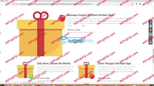
E-Commerce Template: Online Christmas Market
Create automated product listings without writing code!
It’s like a Professional Design School in a box. Earn money during the pandemic from home either as an Agency or a Web Designer for your own service or business.
Where our Beginner Course left off, we continue the journey. Most courses stop at the basics. Now we will take you to the next level of web design. Learn professional web design principles from a Wix Certified Trainer.
You will:
Discover the 4 W’s of Web Design
Add value to your website
Learn foundational design principles
Build a call-to-action button
Implement color palettes
Apply the Law of Contrast
Improve your typography with 3 rules of fonts
Upload custom fonts
Create a video landing page
Create a video/homepage hybrid
Build a page with design strips
Apply animation to buttons and objects
Customize the navigation menu
Find out 3 things your Footer should have
Add an event flyer to your homepage
Create 3 types of photo galleries
Create automated product listings using data tables
BONUS SEO SECTION!
Learn a brief history of Search Engine Optimization, then learn how to use your knowledge to get maximum results.
We will look at the Wix SEO Wizard
How to get your Wix site listed with Google DIRECTLY
How to add blogs to your site: Wix, Blogger, and Tumblr
Transcript from welcome video:
Hello, everyone. I’m Michael Wood at Captivatim Multimedia & Web Design. I’m really excited about this Web Design design course. And yes, I did say, “design,” twice. The reason why is the term “web design” or “web designer” has come to mean so many things; everything from building a website, to designing it, to figuring out search engine optimizations (SEOs), and keywords and blogs — all the way to automation, like automatic bookings and getting people to schedule appointments online. There are so many jobs a web designer of today needs to do.
So I’ve broken it down into basic steps. If you were with me at the Web Design 101 class, we learned to build websites without writing code. We used Wix Artificial Design Intelligence (ADI), we used templates, we used anything we can to just get the site built.
If I were to use a car as an analogy, it’s like we built the car. It’s fast, it moves — it moves great, actually. However, this course is about the paint job. This is where we’re going to make that car look great. We’re going to make your website look stunning and professional.
However, what I’ve come across when I work with clients, is they get stuck at the template stage. Yes, their website is done, it can be published. But what can we do to make the website better? And that’s where this class comes in. I am going to show you the strategies that professional web designers use. We’re going to answer a lot of design types of questions, questions you were probably wondering and didn’t even know who to ask. For example: What kind of fonts should you use? You know, you can go in there and choose 30, 50, even an infinite number of fonts. But which ones are best for websites designed for screens and for mobile devices? How many fonts should you use? What about colors? How many colors should your website have? Can we just choose any colors or are there a predetermined set of colors that should be used? And if so, how do we make the text pop? How do we make it stand out on the screen? What can we do to help our visitors have an emotional response when they go to the “Home” page? Not just to know about your business or service, but to feel it, to get excited about it. What can we do to add to your site to make people feel how awesome your business or service is? How about a video background? Should we do a full-page video background or should we just kind of have a strip, a video strip? Which one is better? And if we went with a strip, why?
So this is not just a how-to-do-things using Wix, this course is going to show you the strategies. Half of it is, yes, here’s how to change your fonts. But the other half is well, why and which ones and under what circumstances should we make those changes?
We’ll talk about colors. Let’s talk about your navigation menu at the top of your website, the heading. What if you have ten pages on your site, but you only have five items of text at the top of the heading? Which pages should go on your navigation menu? And what do you do with the other five pages? How do we tuck those pages under so there’s sort of a drop-down menu? These are nuts-and-bolts types of questions that if you can get the advice from a professional web designer, it’s going to not only save you hundreds of hours of testing and frustration, but it’s going to make your website stand out from the crowd, and in this Internet-crowded space, that is really important. All of these design-specific questions will be answered in this course.
So I’m excited about this. The prerequisite would be that you go ahead and have a website first. If you haven’t taken the 101 class, I encourage you to do so. Or just have a website that you already have built, either from a template or from Wix Artificial Design Intelligence, or perhaps a website that’s just been sitting around for many years and is starting to look old and it needs a renovation. Have a website in mind when you begin this class. Then as I start to show you the strategies design professionals use, you’ll know how to make your website even better.
Let’s go from good to great, and I look forward to seeing you guys in class.
Who this course is for:
Intermediate to Advanced students who want to take their website to the next level.
Beginning students who are learning the web design process.







Reviews
There are no reviews yet.